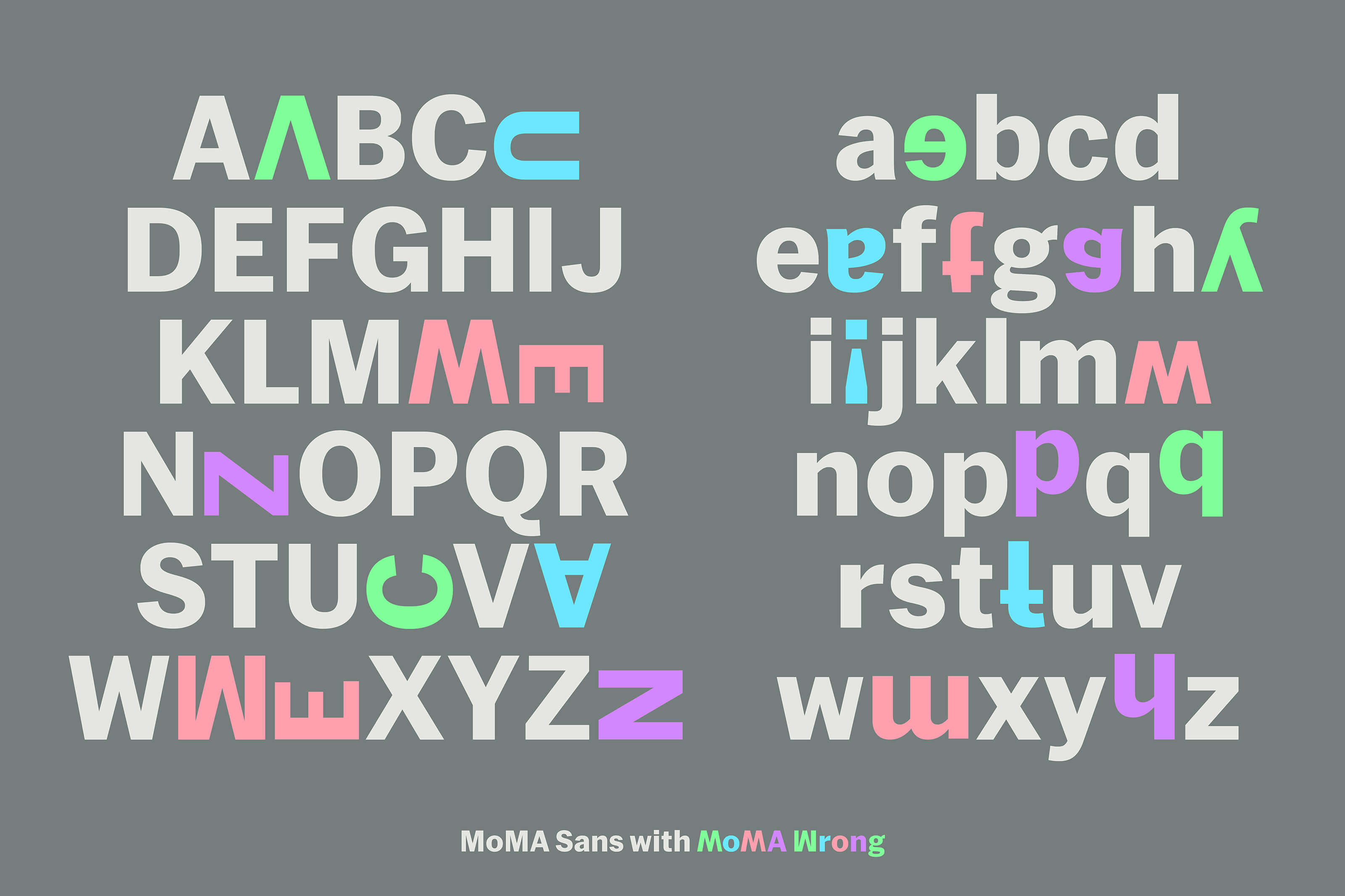
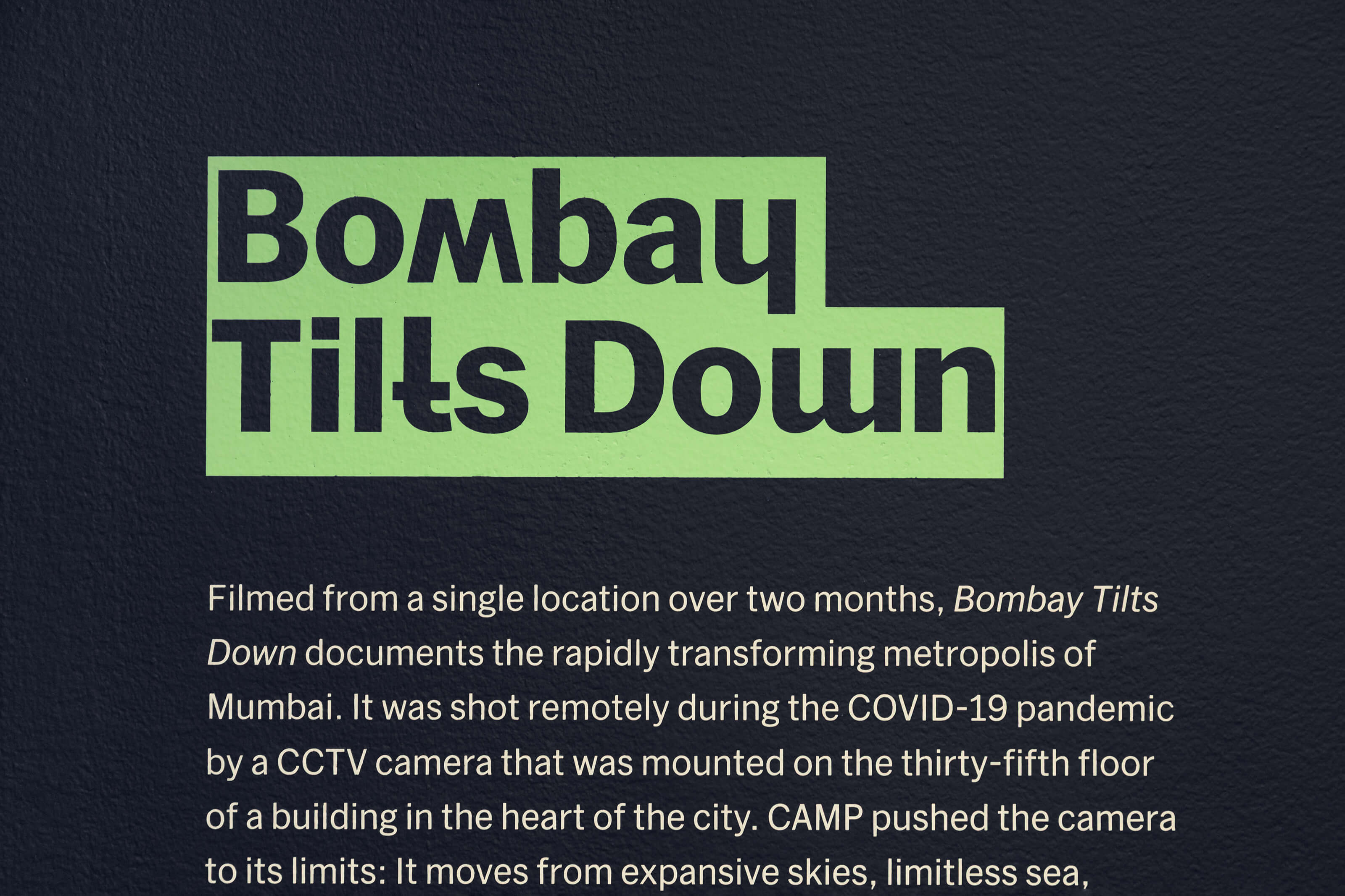
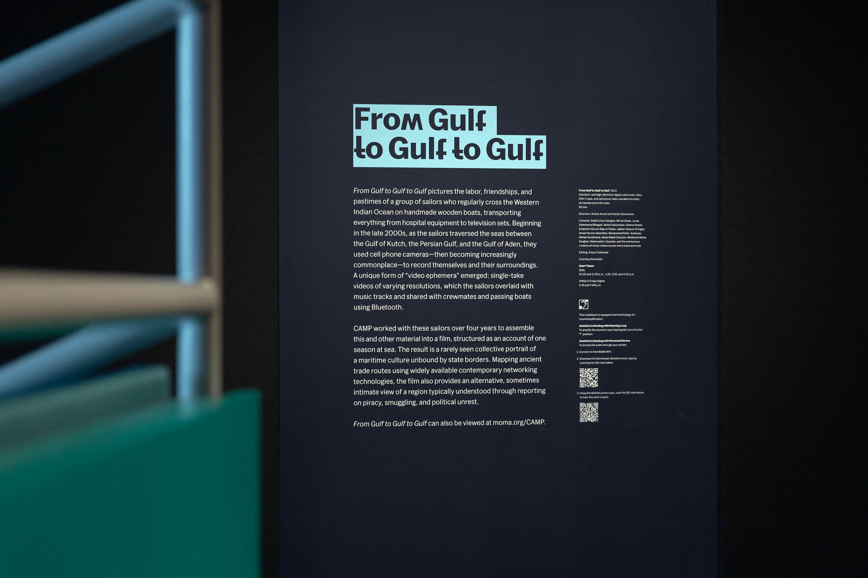
The Mumbai-based artist collective CAMP draws on and rethinks our relationship with everyday technologies like CCTV, cell phones, and the internet. In homage to their playful practice of institutional subversion and critique, the design of this show staged an intervention into MoMA itself. I created “MoMA Wrong,” a bootlegged version of MoMA's official typeface, MoMA Sans, featuring upside-down and swapped letters. This hijacked typeface disrupted the institutional typography throughout the show, and served as a cheeky nod to CAMP's own DIY typeface, “Wrong Font.” The title wall also featured a motion graphic cycling through “backronyms” — backend acronyms CAMP procedurally generated to expand the possibilities of their name.
As a further nod to CAMP's strategy of co-opting existing infrastructure, we removed select sound panels in the exhibition and inserted section texts directly into the openings — embedding the design directly into the show's infrastructure.
In collaboration with Art Director Kevin Ballon and Creative Director Stina Sawdust.


